
Design forecast · 2026
Tile trends that will outlast the trend.
An architect’s guide to scale, surface, colour and the quieter discipline behind memorable floors and walls.
Tiles are no longer a background decision made at the end of a project. They establish rhythm, influence perceived scale and determine how light moves through a room.
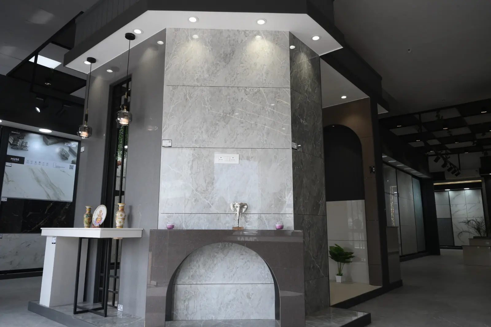
For 2026, the direction is both expressive and composed. Large-format surfaces reduce visual interruption; warm mineral tones replace sterile grey; timber and stone are interpreted with greater nuance; and texture is used to catch light rather than simply decorate a wall.
The crucial distinction is between a trend and a principle. A trend tells us what is newly visible. A principle helps us decide whether it belongs in a particular home. The following forecast therefore pairs each design direction with the architectural reasoning needed to use it well.
The 2026 palette
Warmth, drawn from the landscape.
Chalk
Dune
Travertine
Taupe
Clay
Charcoal
Use these tones as a family rather than isolated swatches. A pale floor, mid-tone joinery and one earthen accent create depth without sacrificing calm.
Eight directions shaping the year
Large format, quieter rooms
The appeal of large-format tile is not size alone; it is visual continuity. Fewer joints allow the eye to travel, making living areas, suites and commercial interiors feel calmer. Formats such as 600×1200 and 800×1600 mm work best when the room geometry, laying grid and edge cuts are resolved before installation.
Marble interpreted—not imitated
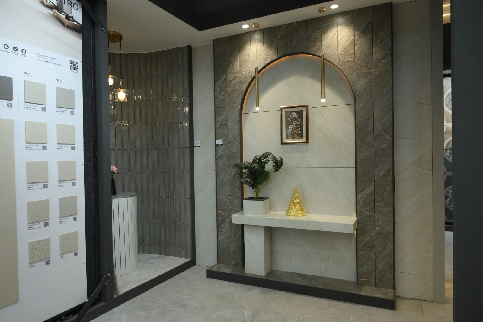
The strongest marble-look surfaces now favour restraint: generous veining, controlled contrast and book-matched possibilities rather than excessive pattern. Warm whites, pearl greys and soft beige stones sit comfortably beside timber, bronze and textured fabrics while offering the predictable maintenance of vitrified tile.
GVT as a design toolkit
Glazed vitrified tiles remain central to modern floor and wall design because they carry colour, stone, concrete and decorative graphics across multiple finishes. The important decision is application: gloss can amplify light in formal areas, while matte and structured finishes better support relaxed or high-use spaces.
The return of warm neutrals
After years of cool grey, interiors are moving towards sand, mushroom, taupe, cream and sun-washed limestone. These hues respond beautifully to Rajasthan’s intense natural light and create a more forgiving background for wood, cane, art and changing furniture.
Wood grain with architectural discipline
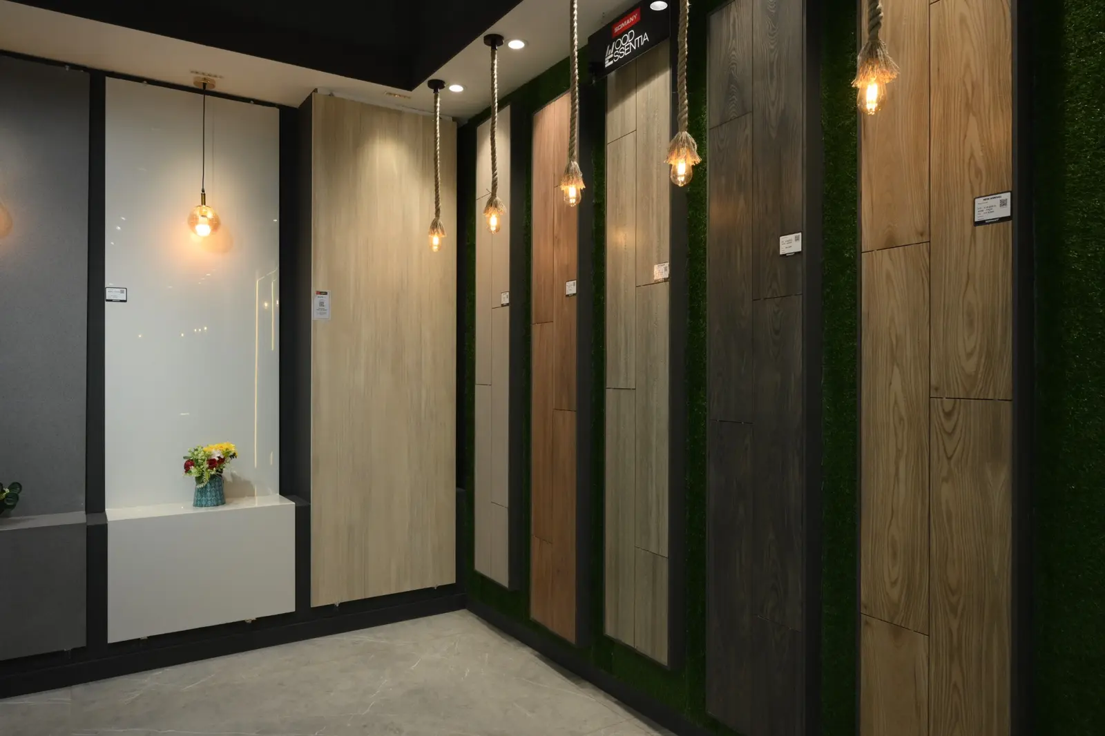
Wood-look tile is most convincing when plank proportions, grain direction and joint colour are treated as part of the architecture. Use it to bring warmth to bedrooms, balconies and transition zones—then keep adjacent surfaces simple so the grain remains intentional rather than decorative noise.
Texture becomes spatial
Fluted, carved and relief tiles are moving beyond decoration to shape how light falls across a wall. A single tactile plane behind a vanity, bed or reception desk can give a room identity. The rule is edit: one expressive surface, supported by quieter floors and joinery.
Pattern in precise doses
Statement tiles are most effective when they define a threshold or activity—an entrance, kitchen backsplash, powder room or balcony—not when they compete across every plane. Repeating one colour from the pattern elsewhere in the room makes the composition feel designed rather than assembled.
Performance becomes part of beauty
In bathrooms and outdoor areas, slip resistance, drainage, edge detail and cleanability must lead the selection. A surface that performs confidently will age more gracefully than one chosen only from a catalogue image. Always assess wet-area and exterior tiles in the finish in which they will actually be installed.
Format & perception
Scale changes how a room reads.
Balanced rhythm
Bedrooms · compact rooms
Elongated continuity
Living areas · walls
Architectural scale
Large rooms · statements
Illustrative proportion guide. Final format should follow room dimensions, laying pattern, substrate quality, movement joints and the installer’s capacity to handle the material correctly.
A practical selection matrix
Choose for the room you have—not the image you saved.
| Area | Design priority | Performance priority | Consider |
|---|---|---|---|
| Living room | Continuity and scale | Wear and easy upkeep | Large-format GVT · marble look |
| Bedroom | Warmth and visual quiet | Comfortable maintenance | Warm matte · wood look |
| Bathroom floor | Calm, coordinated palette | Slip resistance and drainage | Wet-area matte · smaller modules |
| Kitchen wall | Light and personality | Cleanability | Decorative · subway · glossy accents |
| Balcony / outdoor | Relationship to landscape | Grip and weather suitability | Structured surfaces · stone looks |
Three rules worth keeping
A trend becomes timeless when it serves the space.
Edit the palette
Limit the permanent surfaces to a related family of tones; let furniture and art carry easier-to-change colour.
Inspect under real light
View the tile vertically and horizontally, in daylight and warm artificial light, because finish and veining change with orientation.
Resolve the installation early
Confirm the laying grid, joint colour, edge condition, skirting, slopes and transitions before material reaches the site.
Frequently asked questions
Before you choose.
What are the biggest tile trends in 2026?
Large-format surfaces, warm stone colours, refined marble looks, wood grains, tactile feature tiles and carefully placed patterns define the year.
Which tiles work best in modern homes?
Large-format GVT, restrained marble-look tiles and warm matte surfaces are versatile choices, but the right specification depends on the room, traffic, light and maintenance needs.
Can large-format tiles work in a small room?
Yes. Fewer joints can make a compact room feel more continuous, provided the laying grid avoids awkward cuts and the substrate and installation method suit the format.
Which tiles are appropriate for bathroom floors?
Choose a floor tile intended for wet areas with suitable slip resistance, manageable size around slopes and drains, and a surface that is easy to maintain.
Where can I compare tiles in Bikaner?
The Build Mart on the Bikaner–Jaipur Highway presents floor, wall, GVT, large-format, bathroom, decorative and parking tiles in full-size showroom displays.
See the difference at full scale
Compare tile formats, finishes and undertones in person.
The Build Mart · 12 Km Milestone, NH-11, Jaipur Highway, Raisar, Bikaner